I recently obtained access to a large dataset for traffic accidents in the state of Georgia for a school project and I thought it would be fun to do some exploratory data analysis and to visualize the data using python.
The file comes from Georgia Department of Transportation and it ranges from 2006 to 2016. For this exercise I will just focus on the month of October in year 2016. Due to the size ofthe data,
import folium
from folium.plugins import MarkerCluster
from folium.plugins import HeatMap
import pandas as pd

data = pd.read_csv("GAdata.csv")
data1 = data1[data1["month"] == 10]
lats = list(data1["Latitude"])
longs = list(data1["Longitude"])
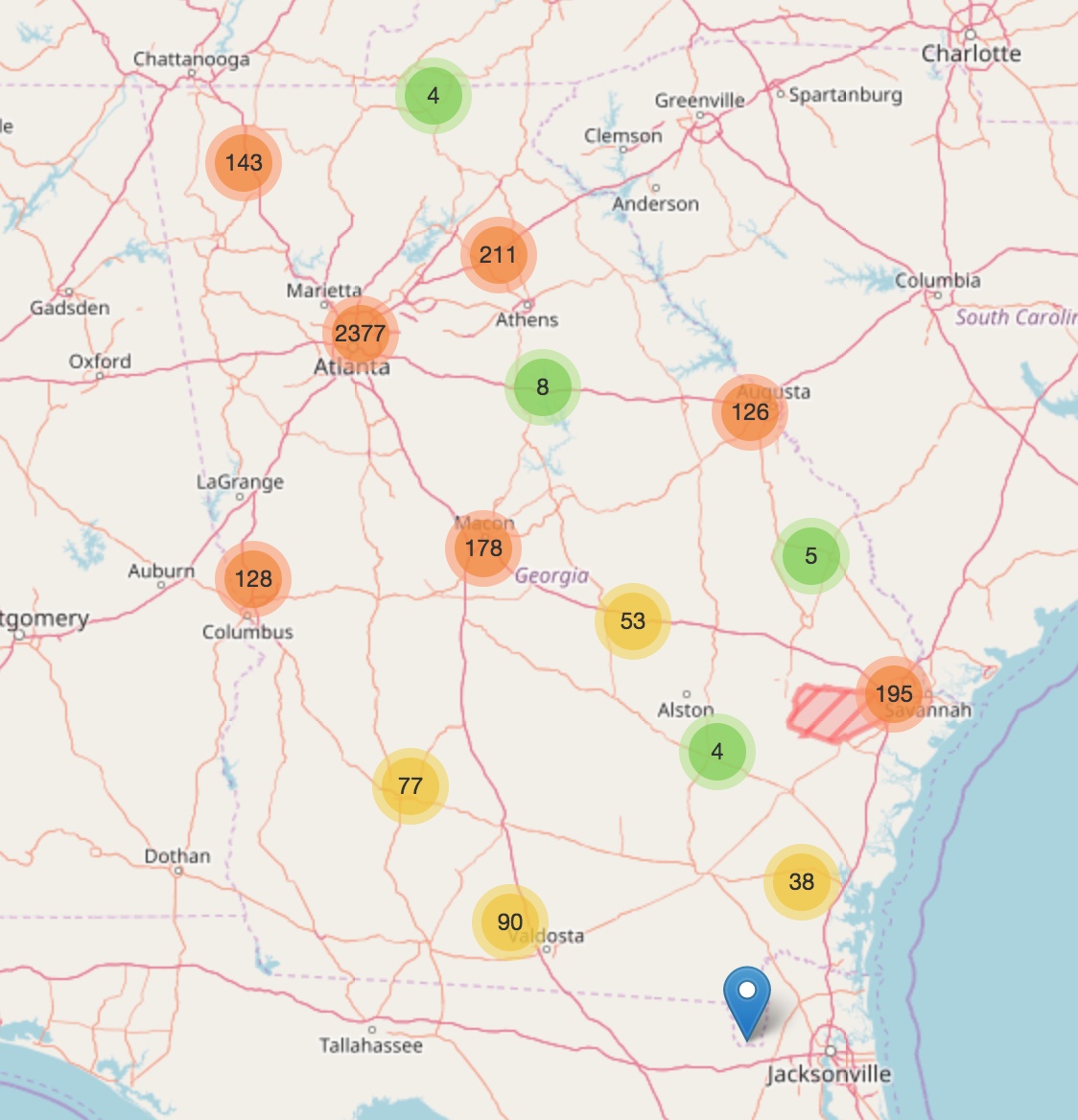
First I will make a map with Folium to show all the how many accidents happened in a certain area. The best way is to show just a cluster of data points using the MarkerCluster function
map = folium.Map(location=[33.75, -84.39], zoom_start=10, tiles="OpenStreetMap")
marker_cluster = MarkerCluster().add_to(map)
for lt, ln in zip(lats, longs):
    folium.Marker([lt,ln]).add_to(marker_cluster)
map.save("Map1.html")
Below is a snapshot of the map and you can view the full map here.
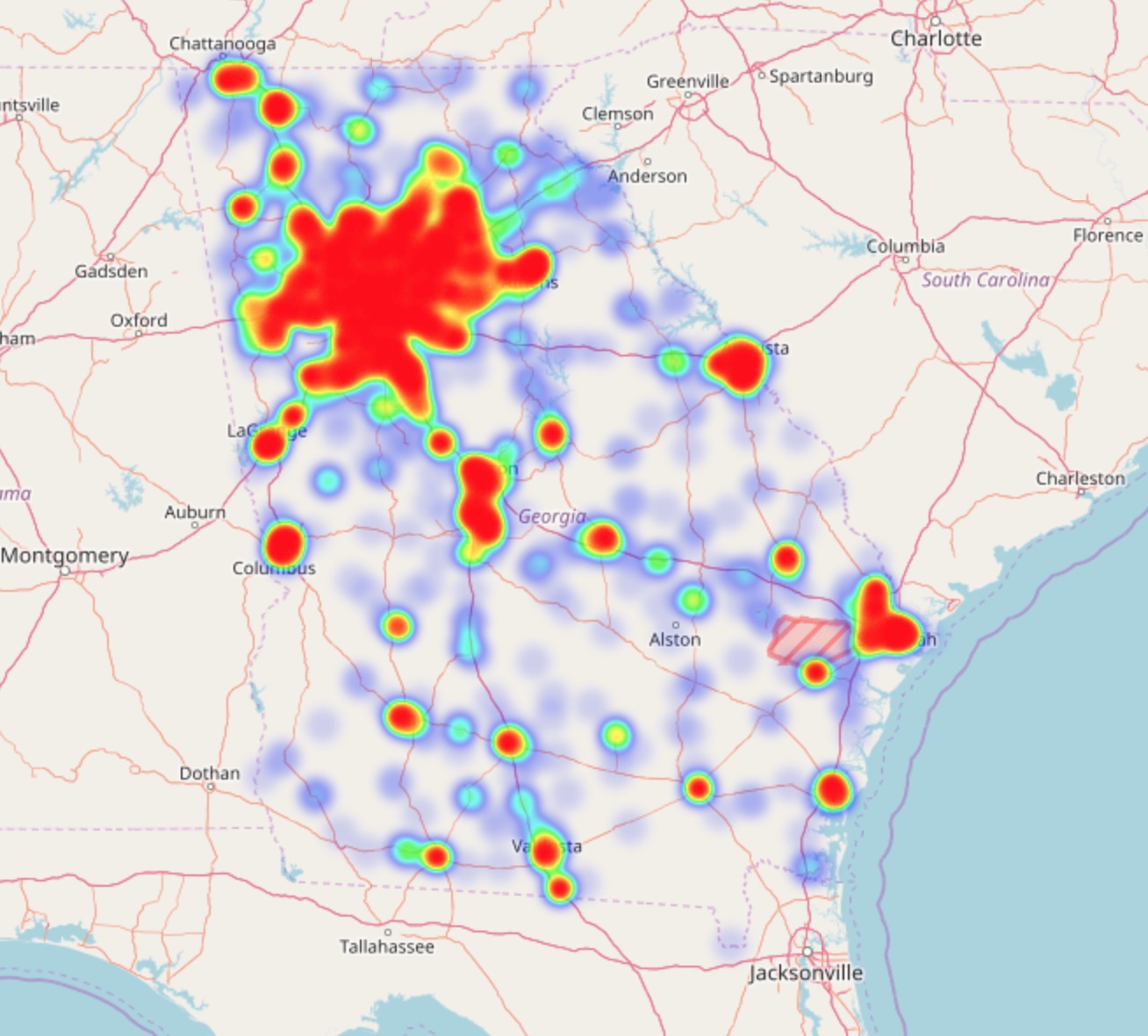
Now, a better way to visualize the number of accidents on a map is to display a heatmap. We can utilize the built-in heatmap function from Folium to achieve this.
data1["Latitude"] = data1["Latitude"].astype(float)
data1["Longitude"] = data1["Longitude"].astype(float)
heatDF = data1[["Latitude", "Longitude"]]

heatmap = folium.Map(location=[33.75, -84.39], zoom_start=10, tiles="OpenStreetMap")
heatdata = [[row["Latitude"], row["Longitude"]] for index, row in heatDF.iterrows()]
HeatMap(heatdata, min_opacity=0.1, max_zoom=10, radius=10, blur=10, max_val=0.8).add_to(heatmap)
heatmap.save("heatmap.html")
Here’s what it looks like and the full map can be viewed here.